Wednesday, July 13, 2011

Egocentricity in 3D


One of the projects I did this past month at work required some 3D rendering.
OOH BOY NEW TOOLS!

I used a free program called "blender" at work, since it was, well, free.
It's not the most intuitive program for beginners. You really do have to sit down and read ALL the instructions (there are mountains). And heaven forbid you press the wrong key combination.

Long story short: had fun, wanted more. But not with blender (sorry guys - it's just not for me)
So I dug around the internet and found this tutorial on psdtuts+
Different program (I had to use a demo, but it's very shiny and friendly!)
I'm a sucker for punishment. Picked one of the harder ones right off the bat.

My end result is very different from the tutorial.
I didn't want to shell out the cash for stock imagery, so I used what I had lying around from previous projects (thank you book design, for your ample assortment of gear imagery)
Also didn't like the greenish tint to the final image, so I left mine in warm greys.

Long story. Gist is: Tori likes 3D.
Tori may do more in the future.

Friday, April 15, 2011


Decided to keep practicing photo editing as a time-waster today.

I think this lovely lady's name is Elantra. She was very much a camera hog. Three other mares were out with her but she'd just shove them out of the way and strike a dramatic pose every time I moved the camera.

Tsk. Such a drama queen.

Tuesday, March 29, 2011

Jellyfish. All the way down.


Just a little tribute to an adorable movie.
Wrote a report on Pixar for my management class this term. Considering how faboo they are I figured they could use a customized cover. This is it.

Monday, March 28, 2011

Who?


Just a little doddle to make you smile.

Corporate Identity - Vespa Rebrand


This project is still ongoing, but the logo-building is done.
A rebrand of Vespa (when I say that word I want to make an engine sound. I don't understand why. Vrrrrrrrrrr)

These are the two strongest choices out of all the options I came up with for a rebrand. A logo, and a wordmark. The logo is the one that won out. Those spirals were just too fun not to play with some more. At the moment it's in the process of being turned into a style guide, complete with sizing rules and how to use it on everything from business cards to scooters.

I was torn about which one to expand further. Both are fun.
How fantastic is it that Vespa had the convenient V and A as the first and last letter?
And that S in the very center!
Perfect to work with.

Let me tell you a secret: curled gradients suck. They're very cranky and they don't like you on principle. The green logo is a series of layered opaque shapes that overlap to create the curved colour changes.

Organ Greeting Cards


One of the best projects I got to take part in this year was a contest of sorts. An employee of Unisource (a paper supplier, see info here) and one of the YSDN professors are neighbors. She got telling him about the graduation show, and how we were looking for fund raising opportunities. He gave us the coolest fundraiser I have ever seen.

Unisource offered the graduating class 3000 dollars. 2000 in cash, and 1000 in paper...
For six greeting cards.

The deal was, every graduating student would come up with at least one greeting card. It could be seasonal, general, whatever. Any words used had to be bilingual. Out of the 90-odd cards a team of students chose 18 to show Unisource. Unisource then chose the winning six. Those six cards will be printed and sent out to design firms all over Canada to advertise a new line of paper called "Loop" (by Mohawk - lovely recycled paper!)

These three cards are a joint effort between myself and the lovely Veronica Windus, a fellow classmate. We decided to do something a little weird and put stylized vital organs on our cards.
Veronica drew the sketches of the organs (and the swirls) and I did all the digitizing and colour.
The brain I did on my own, since two cards seemed like an odd number.

"Thinking of you"
"You're always on my mind"
"Happy Valentine's day"
"Happy Earth Day"
"You're the air I breathe"

I've got more corny sayings if you want em.

Other than the host of hilarious taglines we could give these, there was a reason for choosing organs. The paper being advertised is loop, so logically we played up the name by choosing systems (circulatory systems, nervous system).

P.S. We didn't get picked :( But that's okay! We still know we're awesome.

Travelling Treasures - Exhibit Design


A full year of work has finally finished.
Blood, sweat, and tears (both literal and figurative) went into this.
Funny how this big ol' booklet caused so many troubles.

It was a challenge getting started. I knew from the start that if I wanted things to go smoothly I had to get the identity of the exhibit organized... and it just wouldn't cooperate. I ended up designing the whole thing without an identity in mind, which tortured me a little. Eventually I had enough similarities in the pieces that I could put together a solid explanation of how the identity would work, and rework everything to suit what I had come up with.

Lesson learned: identity design takes forever. Sometimes it's better to wing it and build the identity out of the pieces of the project that really work.

Business Cards


I might be addicted to those multicoloured droplets.
Just a little. I can quit whenever I want! Honest!

Thursday, February 17, 2011

Pax


Had a rather long bout of creativity (read: desperation to do something other than design) the other night. We're talking 6pm to 2am sort of creativity. I'd never drawn something directly into the computer before (successfully, anyway). She started out as a random face on a very tiny canvas in Photoshop and eventually spawned into a massive vector poster. I'd say the 8 hours of fiddling (and severe hand cramps) was worth it.

Tuesday, December 14, 2010

Book Design - Steam


After many hissy fits and several threats to give up entirely I finally finished my book.
PHEW. Am I ever glad that ordeal is over.

I wrote the entire manuscript. Something I never want to do again. I'll be quite happy letting actual authors do the dirty work from now on.

It's got a faux-leather cover, red endpapers, a red ribbon, several stamps (that alternate between gold stamped or blind stamped) on the cover and spine, and a red bellyband (with another gold stamp). You wish you had one of these. They're actually kind of snuggly, if I book can be snuggly.

I won't go into all the drama of the making of this monster.
Needless to say it caused much undue stress and plenty of sleepless nights.


Monday, December 13, 2010

Typeface Design

I invented a typeface!
Am I excited about it? Oh yes. Very. Typing doesn't do this justice.

We spent the entire term sketching, refining, and eventually kerning (that was a huge pain and I doubt I'll ever be finished with the kerning) our respective typefaces.

Other than the actual invention of the typeface we had to create a promotional piece of some sort to help advertise. This is the promotional piece for mine (one of the two - the second suffered through a rather terrible photoshoot and I haven't salvaged a picture of it just yet).
It's a roughly 36" long, accordion-fold, type specimen (and a huge pain in my butt).
Nobody wants to print one copy of a 36" x 5.5" student project. 500 of them sure. But not one.
Other than the usual printing-as-a-student drama I love this. I love the typeface. I love life.
It still needs a lot of work. It's a working typeface (I had a little joy fit when I first typed with it) but it still needs a lot of technical refinement.

The missing thing (which you'll see as soon as I fix the pictures) is a little rocket ship that was a companion piece to the big folded specimen. It was full of white chocolate wafers that had the entire alphabet (upper and lower case) carved into the faces.

Saturday, September 18, 2010

Bridal Shower Invitation


An invitation I made for Lauren's bridal shower.
Got to love the fun things you can find in Illustrator when you dig around in the file lists.

Monday, August 16, 2010

La Girandole Advertisement


Another of the projects I worked on at my internship. La Girandole is a regular customer at PIGI. The sales staff wanted their advertisement for studio space rentals to look a little better than the usual Word-document ads that show up on bulletin boards (even though that's exactly where it was going to be posted).

In the end they even used it as a full page ad at the back of this year's summer/fall dance class brochure.

It drives me a TINY bit crazy that we couldn't quite get the widows and orphans in the type to cooperate, but we just didn't have too many options for moving things around. There was a very specific format to follow.

IEA Marketing Brochure


This is a potential design for IEA (International Executives Association). My internship placement, PIGI (pigi.ca) is a member of the association, and the owner suggested that the designers at PIGI come up with a new idea for a marketing brochure.

I have no idea if this will be the final choice for the design, but Eric seemed to like it.
Either way, it's a good start for them to work on. Plus it's only two colours, so it will be a bit more cost effective to print for them.

Since it's a PIGI owner who ordered the design, I was allowed to go a little crazy with the design options. The white spaces you see at the top are meant to signify a die-cut. The real brochure would have a curve cut at the top of each page. If the pages seem to be a bit out of order, it's because this is a gate fold. Here's a link to a gate fold diagram

E-Book Covers


Some freelance design work from this summer.
They're slowly being posted on Amazon if you're interested.


Well, this was long awaited wasn't it? The last project from third year design, Information Design 3. Excuse my laziness, but I had completely forgotten I had photos of the final project.

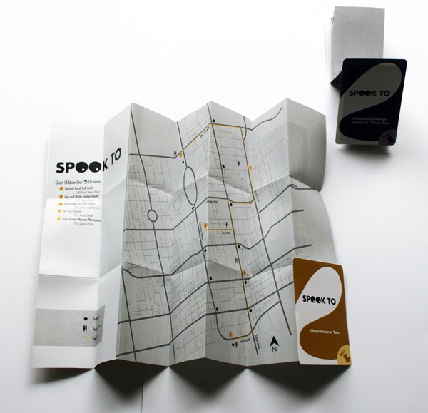
Our goal was to create a wayfaring system, with a theme, for downtown Toronto. Wayfaring is pretty easy to describe: something that helps you find your way. Like maps, signs, etc. Some of my classmates chose to make design related systems (that showed where to find the best typography downtown, bookstores with great design references, and design firms), another made a system for shop owners on Yonge street that would help tell customers when each store was open or closed.

Mine was a tourist-centered project, that focused on giving people a selection of haunted tours of Toronto to use. The project uses both print (hand-held maps colour coded for each tour), and electronic (phone numbers at each site, printed on signs, that users may call to receive detailed information about the ghosts on site) elements.

These are pictures of the mock-up maps. Each colour designates a different tour, and to help with navigation each includes a photo of the buildings on the tour. For the purpose of the project we only had to mock-up a few maps, or samples (not everyone used print for their projects). But we had to have several other options laid out, as if we were pitching the idea to a client.

Aewyn


For a first time attempt at photographing horses in motion, I'd say this turned out alright!

Aewyn was a little cranky during this ride, so it's a miracle I got a shot with her ears forward. I'm working on some photos of Becca and Aweyn taking some jumps as well. They'll be up soon.

Edit: once again, the internet has destroyed the colour of the photo. Sorry :(

Thursday, July 29, 2010

CSCFC logo


A lot of the projects from working at PIGI are still in process, so I can't really share them with you. This one, on the other hand, was finished up weeks ago.

Logos for the Centre Scolaire Communautaire Francophone de Canmore.

Cardinal


Latest news: my internship at Printing Impressions and Graphics Incorporated (pigi) is now over. Sadly. I had a great time, met some fantastic people, and worked on some fun projects.

This fellow is from one of the Christmas card projects I worked on.
Very different style than I'm accustomed to, but I really like how he turned out.
He's put together with a LOT of drop shadows, and way more gradients than is really necessary in one image.

Once Upon a Midnight Dreary


Haven't posted anything in a while, so I thought I should find something to show off.
I found her in my sketchbook way back at the end of semester last year.

I was in a crow phase, apparently.

Arranging those circles was a major pain, I have to say.
Nothing quite like trying to center everything in Photoshop to make your day a little more stressful.