Thursday, November 27, 2008

Typography 2 - Project 3


I have officially gone cross-eyed twice and fallen asleep at my desk three times since beginning this project. But it's done, and boy am I proud.

Project 3 was to create a book from scratch, using the article we had written about our famous typographer! We had to do everything (dedication page, acknowledgments, copyright, everything)

Mine is filled with dummy pages (basically just blanks) to make it thicker.
It's about an inch thick, and its covered in a gorgeous piece of suede. I want to snuggle it, but it's a book... not a teddy bear.
(The cover is a dust cover - I wasn't about to ruin that nice suede with printing...!)

The dust cover (as you can see from the actual image of it) printed a lot darker than the original file (which happens a lot when you go from screen to printer, one type of paper to another, or even between two different printers)
Thankfully it didn't do what it sometimes does and completely change the color (I've had blues print green before...!) and the darker brown turned out to be awfully nice.

I'm not going to post full size pictures of the inside (since there would be a lot of them)
Thursday, November 20, 2008

Ooh baby, baby!


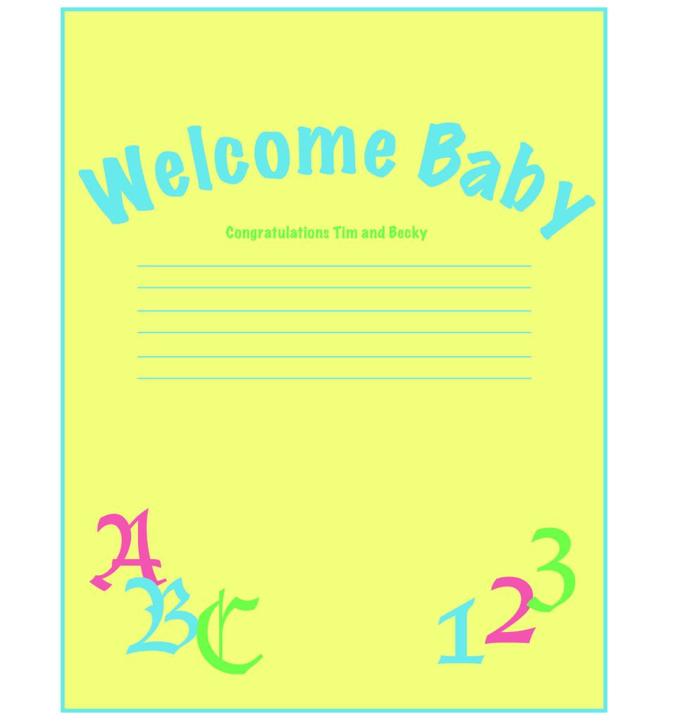
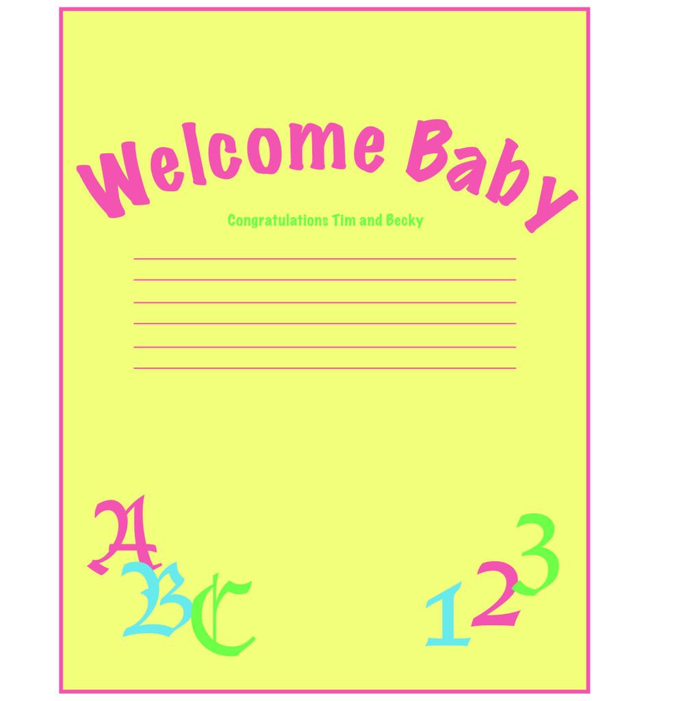
Tim and Becky are expecting their first baby this February, and since Tom and Agnes (who are undoubtedly going to turn out to be the most spoiling grandparents in existence) were nice enough to hold the baby shower on the weekend I'm visiting I thought I'd make a present for the Momma-to-be.

Wednesday, November 5, 2008

Electronic Landscape - P1

Talk about developing a severe hatred for quotes.
In this project we had to literally steal quotes from people, not list their names, and make a website with some deep philosophical meaning from it.
No original words allowed AT ALL.

Anyway, as much as I hated the not giving credit thing (and, for that matter, the having to give it a meaning) here's what I made:
Connections Website


I made mine revolve around connections - either abstract or obvious.
It's about as deep as I could go without losing my mind.

Typography 2 - Project 2


Ahhh - another type project over and done with.
And ANOTHER that I'm proud of!
This is a momentous occasion. Cake for everyone.

For project 2 we had to try out hand-lettering. It's as easy to understand as it seems: we literally had to draw the letters for the main title by hand, or use natural media. No computers until you were ready to clean it up for final setup and printing.

We had to create a small flyer advertising a festival of our choice. Some people chose the Pride parades, others Open Mic nights, or literature festivals. Two of us picked Maple Syrup-related festivals.
Mine is the weekend at King's Landing when they boil up sap in cauldrons and make candy on the snow for visitors.

I had a lot of fun making words out of tissue paper and glue, doodling out strange titles in pencil... and then it happened: I used ink and blew on it with a straw.
Glorious day.
I made a lovely mess, and got COATED in super-black ink, but it was all worth it when Mary Ann liked the first try (the woman is very hard to please!)

EW the image in full-size is horrible, but it's the only way to see details.
Imagine it smaller. The real size is 5" x7"

WaistcoatCAT

Wow - dug this up out of the bowels of the hard drive.
Our final project for interactivity design last year was to create a website: this is my little creation.
The general rule was this: include all your information from the previous two projects, and it has to be a website.

Surprisingly difficult for so simple a set of directions.
I'm particularly fond of the mascot - he turned out really cute.

WaistcoatCAT