Monday, August 16, 2010

La Girandole Advertisement


Another of the projects I worked on at my internship. La Girandole is a regular customer at PIGI. The sales staff wanted their advertisement for studio space rentals to look a little better than the usual Word-document ads that show up on bulletin boards (even though that's exactly where it was going to be posted).

In the end they even used it as a full page ad at the back of this year's summer/fall dance class brochure.

It drives me a TINY bit crazy that we couldn't quite get the widows and orphans in the type to cooperate, but we just didn't have too many options for moving things around. There was a very specific format to follow.

IEA Marketing Brochure


This is a potential design for IEA (International Executives Association). My internship placement, PIGI (pigi.ca) is a member of the association, and the owner suggested that the designers at PIGI come up with a new idea for a marketing brochure.

I have no idea if this will be the final choice for the design, but Eric seemed to like it.
Either way, it's a good start for them to work on. Plus it's only two colours, so it will be a bit more cost effective to print for them.

Since it's a PIGI owner who ordered the design, I was allowed to go a little crazy with the design options. The white spaces you see at the top are meant to signify a die-cut. The real brochure would have a curve cut at the top of each page. If the pages seem to be a bit out of order, it's because this is a gate fold. Here's a link to a gate fold diagram

E-Book Covers


Some freelance design work from this summer.
They're slowly being posted on Amazon if you're interested.


Well, this was long awaited wasn't it? The last project from third year design, Information Design 3. Excuse my laziness, but I had completely forgotten I had photos of the final project.

Our goal was to create a wayfaring system, with a theme, for downtown Toronto. Wayfaring is pretty easy to describe: something that helps you find your way. Like maps, signs, etc. Some of my classmates chose to make design related systems (that showed where to find the best typography downtown, bookstores with great design references, and design firms), another made a system for shop owners on Yonge street that would help tell customers when each store was open or closed.

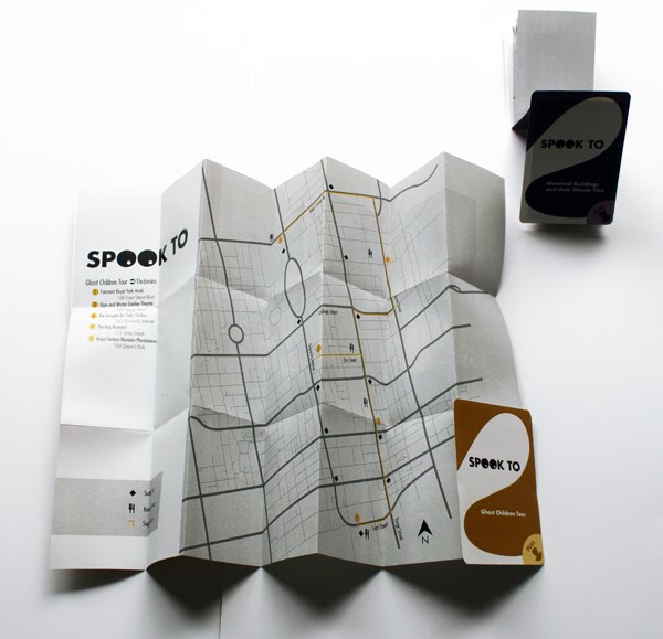
Mine was a tourist-centered project, that focused on giving people a selection of haunted tours of Toronto to use. The project uses both print (hand-held maps colour coded for each tour), and electronic (phone numbers at each site, printed on signs, that users may call to receive detailed information about the ghosts on site) elements.

These are pictures of the mock-up maps. Each colour designates a different tour, and to help with navigation each includes a photo of the buildings on the tour. For the purpose of the project we only had to mock-up a few maps, or samples (not everyone used print for their projects). But we had to have several other options laid out, as if we were pitching the idea to a client.

Aewyn


For a first time attempt at photographing horses in motion, I'd say this turned out alright!

Aewyn was a little cranky during this ride, so it's a miracle I got a shot with her ears forward. I'm working on some photos of Becca and Aweyn taking some jumps as well. They'll be up soon.

Edit: once again, the internet has destroyed the colour of the photo. Sorry :(