Wednesday, January 23, 2008

Wayfarer


It took me forever to decide what to call this.
I even had all my friends send me their ideas - I ended up picking only a piece of one suggestion.

WOW canvas painting is fun.
This is my first ever attempt at paining with acrylics on canvas.

It turned out... pinker... than I'd wanted. But I suppose that's what I get for flying by the seat of my pants!
I HAVE learned a few things from all the guesswork: one being to paint the background first.

It's a Japanese crane.
I have no real explanation as to why I picked that particular bird, other than the fact that they're gorgeous animals. They have a bright red cap on their heads, and snow white feathers.

They also do a ridiculous courtship dance, but we won't get into that.

As for the gigantic ribbon: what can I say?
I like fabric.


Here are a couple close-ups:


Friday, January 11, 2008

His Forest


This was a boredom drawing that turned into something more.

I didn't really have a reason for it - I just desperately wanted to draw something with antlers. One girl who saw it on my other art site mentioned that it reminded her of woodland indian beliefs, where every species of animal has a guardian spirit that watches over them.

She thought maybe that's what this fellow could be: guardian for elk.


The background was the hardest. I rarely have the patience (or the knowledge) to draw in full backgrounds and make them look right. Maybe it helped that all of this was done at ungodly hours of the morning?

Either way - I drew everything except the elk guardian himself directly into my art program on my laptop. Which made it a lot harder: drawing onto paper is easier to control.

Either way: I'm pleased with how it turned out in the end.

Thursday, January 10, 2008

La Reina d'Invierno


Observe as I make pathetic attempts to create a title in Spanish, armed only with an online dictionary and some knowledge of French.

But no one has screamed at me yet for using terrible grammar, so I must be at least close to something logical.


Just a little doodle from the margins of some notes that turned into something a great deal nicer than "doodle" can adequately describe.

Shading in all one color is hard - and even harder on a plain white background.

One mistake and you can TELL where it is.
But in the end I really do like how it turned out. Her lips especially - I've never been very good at coloring lips, but this turned out well. Maybe it was the random color choice than helped.


She's supposed to be a snow queen.

I had a fancy description for her, but at this point I just want to go to bed. I might update later with the fancy one.

Typography I - Project 3


The final project for typography was to research a certain writing style from a given time period and create a mock poster - as if there was going to be an exhibit on your chosen writing style on display at the Royal Ontario Museum (hence the ROM logo on the poster) and you were the designer in charge of creating the advertising poster.


I ended up getting Chinese Ideograms (our professor tossed a bunch of options into a hat and got us to draw for them)

Typography I - Project 2


Project 2 for typography was to work with more than just a couple letters (like in project 1)

The most fun about it was the fact that we got to design a fake cover for a book of Aesop's Fables.


I learned something fun with this project, too: you can technically cheat and use a million colors in a project, even if it specifies a maximum of two.

As long as you use different percentages of the same color (the background of this picture is 100%, where the symbol is only 5%) then the ink cartridges don't have to be changed in the printers - and it counts as only one color.

There was only one color used for this whole cover.

Typography I - Project 1


Project 1 for typography was to create two different monograms for yourself, using only six choices for typefaces.

(that doesn't seem like a big deal - but NONE of the available choices were fancy by ancy stretch)


One had to be two black letters, on a white background.

The second had to be one black letter, with one white letter punched out of the black.


My personal favorite is the first one.

My attempt at the second worked better in my initial ideas, and in one of the versions I later scrapped because I didn't think it fit the criteria my professor had asked for.

Visual Language - Project 4 (3/3)


Project 4 was a recap of what we learned in project 1, only this time around we were allowed to use anything we wanted.
We still had to illustrate these concepts:


- Texture
- Direction
- Weight
- Scale
- Space
- Form


But we were allowed to, say, draw something abstract, or paint something, etc. It didn't have to be just circles, squares, or triangles.


These are the multiple contrasts. They are the only ones that were allowed to include color.

For the multiples we had to combine three of the concepts (so, perhaps texture, direction, and form) into one image.


Visual Language - Project 4 (2/3)


Project 4 was a recap of what we learned in project 1, only this time around we were allowed to use anything we wanted.


We still had to illustrate these concepts:- Texture
- Direction
- Weight
- Scale
- Space
- Form


But we were allowed to, say, draw something abstract, or paint something, etc. It didn't have to be just circles, squares, or triangles.


These are the double contrasts. For these we had to take two of the concepts (so... perhaps scale and space) and create one image.

Visual Language - Project 4 (1/3)


Project 4 was a recap of what we learned in project 1, only this time around we were allowed to use anything we wanted.

We still had to illustrate these concepts:
- Texture
- Direction
- Weight
- Scale
- Space
- Form

But we were allowed to, say, draw something abstract, or paint something, etc.
It didn't have to be just circles, squares, or triangles.

These are the single contrasts.

Visual Language - Project 3 (2/2)


Project 3 for Visual Language was a lot of fun.
We had to pick two of our favorite scans from project 2, and then teach ourselves how to use Adobe Illustrator by tracing over the images and create several different variations of the original.

One is a direct translation: it looks as close to the original as possible.
The other three take elements of the original and become new abstract images.

These are based off of a photocopy of my watch.

Visual Language - Project 3 (1/2)


Project 3 for Visual Language was a lot of fun.

We had to pick two of our favorite scans from project 2, and then teach ourselves how to use Adobe Illustrator by tracing over the images and create several different variations of the original.


One is a direct translation: it looks as close to the original as possible.

The other three take elements of the original and become new abstract images.


These are based off of a pepsi bottle photocopy.

Visual Language - Project 2 (10/10)


Out of all the projects for Visual Language this one was the best.
Hands down.

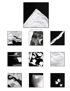
It's a photocopy archive: which basically means it's a bunch of images created by photocopying assorted things we found lying around.
After the two weeks were up I'm QUITE certain that all Xerox owners within a two mile radius of the campus hated my professor. People photocopied FOOD, and WATER, and SHOES.

You name it - it went onto those machines.

This set of 10 images is of my watch.

Visual Language - Project 2 (9/10)


Out of all the projects for Visual Language this one was the best.
Hands down.

It's a photocopy archive: which basically means it's a bunch of images created by photocopying assorted things we found lying around.
After the two weeks were up I'm QUITE certain that all Xerox owners within a two mile radius of the campus hated my professor. People photocopied FOOD, and WATER, and SHOES.

You name it - it went onto those machines.

This set of 10 images is of tissues.

Visual Language - Project 2 (8/10)


Out of all the projects for Visual Language this one was the best.
Hands down.

It's a photocopy archive: which basically means it's a bunch of images created by photocopying assorted things we found lying around.
After the two weeks were up I'm QUITE certain that all Xerox owners within a two mile radius of the campus hated my professor. People photocopied FOOD, and WATER, and SHOES.

You name it - it went onto those machines.

This set of 10 images is of Q-Tips.

Visual Language - Project 2 (7/10)


Out of all the projects for Visual Language this one was the best.
Hands down.

It's a photocopy archive: which basically means it's a bunch of images created by photocopying assorted things we found lying around.
After the two weeks were up I'm QUITE certain that all Xerox owners within a two mile radius of the campus hated my professor. People photocopied FOOD, and WATER, and SHOES.

You name it - it went onto those machines.

This set of 10 images is of a pair of my shoes.

Visual Language - Project 2 (6/10)


Out of all the projects for Visual Language this one was the best.

Hands down.


It's a photocopy archive: which basically means it's a bunch of images created by photocopying assorted things we found lying around.

After the two weeks were up I'm QUITE certain that all Xerox owners within a two mile radius of the campus hated my professor. People photocopied FOOD, and WATER, and SHOES.


You name it - it went onto those machines.


This set of 10 images is of passport pages.

Visual Language - Project 2 (5/10)


Out of all the projects for Visual Language this one was the best.

Hands down.


It's a photocopy archive: which basically means it's a bunch of images created by photocopying assorted things we found lying around.

After the two weeks were up I'm QUITE certain that all Xerox owners within a two mile radius of the campus hated my professor. People photocopied FOOD, and WATER, and SHOES.


You name it - it went onto those machines.


This set of 10 images is of my keys.

Visual Language - Project 2 (4/10)


Out of all the projects for Visual Language this one was the best.

Hands down.


It's a photocopy archive: which basically means it's a bunch of images created by photocopying assorted things we found lying around.

After the two weeks were up I'm QUITE certain that all Xerox owners within a two mile radius of the campus hated my professor. People photocopied FOOD, and WATER, and SHOES.


You name it - it went onto those machines.


This set of 10 images is of hair elastics.

Visual Language - Project 2 (3/10)


Out of all the projects for Visual Language this one was the best.

Hands down.

It's a photocopy archive: which basically means it's a bunch of images created by photocopying assorted things we found lying around.

After the two weeks were up I'm QUITE certain that all Xerox owners within a two mile radius of the campus hated my professor. People photocopied FOOD, and WATER, and SHOES.


You name it - it went onto those machines.


This set of 10 images is of my favorite earrings.

Visual Language - Project 2 (2/10)


Out of all the projects for Visual Language this one was the best.
Hands down.

It's a photocopy archive: which basically means it's a bunch of images created by photocopying assorted things we found lying around.
After the two weeks were up I'm QUITE certain that all Xerox owners within a two mile radius of the campus hated my professor. People photocopied FOOD, and WATER, and SHOES. You name it - it went onto those machines.

This set of 10 images is of assorted cards I had in my wallet.

Visual Language - Project 2 (1/10)


Out of all the projects for Visual Language this one was the best.

Hands down.


It's a photocopy archive: which basically means it's a bunch of images created by photocopying assorted things we found lying around.

After the two weeks were up I'm QUITE certain that all Xerox owners within a two mile radius of the campus hated my professor. People photocopied FOOD, and WATER, and SHOES. You name it - it went onto those machines.


This first set of 10 images is of a Pepsi bottle.

Visual Language - Project 1 (6/6)


This is page one of six for the first project I had to do in my Visual Language class last term.

As simple as it may seem, it was a VERY difficult project to wrap my brain around.

We had to illustrate six concepts:

- Texture

- Direction

- Space

- Weight

- Scale

- Form


Easy enough, since I already knew what they meant from previous art classes in highschool (texture is making something look textured, direction is where it points or leads your eye, space is where it is on the page and how it takes up space, weight is how it draws your eye to heavier seeming objects, scale is size and, form is... well, form)

The tricky part was that we were only allowed to use SOLID BLACK objects. No white except in the background, no holes punched out of shapes, not even outlined shapes could be used.

AND we could only chose from three basic shapes: a cirle, a square, or a triangle. You were not allowed to mix and match (each image had to be made of ONLY circles or ONLY squares - not a mix of both)

We then had to make TWO images for each concept, and make them look different.

It was really hard to make all of them look different, and yet be interesting at the same time.


For part three of the project (this includes this page and page 5/6) we had to combine THREE of the concepts and create more images.

Visual Language - Project 1 (5/6)


This is page one of six for the first project I had to do in my Visual Language class last term.
As simple as it may seem, it was a VERY difficult project to wrap my brain around.
We had to illustrate six concepts:
- Texture
- Direction
- Space
- Weight
- Scale
- Form
Easy enough, since I already knew what they meant from previous art classes in highschool (texture is making something look textured, direction is where it points or leads your eye, space is where it is on the page and how it takes up space, weight is how it draws your eye to heavier seeming objects, scale is size and, form is... well, form)
The tricky part was that we were only allowed to use SOLID BLACK objects. No white except in the background, no holes punched out of shapes, not even outlined shapes could be used.
AND we could only chose from three basic shapes: a cirle, a square, or a triangle. You were not allowed to mix and match (each image had to be made of ONLY circles or ONLY squares - not a mix of both)
We then had to make TWO images for each concept, and make them look different.It was really hard to make all of them look different, and yet be interesting at the same time.


For part three of the project (this includes this page and page 6/6) we had to combine THREE of the concepts and create more images.

Visual Language - Project 1 (4/6)


This is page one of six for the first project I had to do in my Visual Language class last term.
As simple as it may seem, it was a VERY difficult project to wrap my brain around.
We had to illustrate six concepts:
- Texture
- Direction
- Space
- Weight
- Scale
- Form
Easy enough, since I already knew what they meant from previous art classes in highschool (texture is making something look textured, direction is where it points or leads your eye, space is where it is on the page and how it takes up space, weight is how it draws your eye to heavier seeming objects, scale is size and, form is... well, form)
The tricky part was that we were only allowed to use SOLID BLACK objects. No white except in the background, no holes punched out of shapes, not even outlined shapes could be used.
AND we could only chose from three basic shapes: a cirle, a square, or a triangle. You were not allowed to mix and match (each image had to be made of ONLY circles or ONLY squares - not a mix of both)
We then had to make TWO images for each concept, and make them look different.
It was really hard to make all of them look different, and yet be interesting at the same time.


For part two of the project (this includes this page and page 3/6) we had to combine TWO of the concepts and create more images.

Visual Language - Project 1 (3/6)


This is page one of six for the first project I had to do in my Visual Language class last term.
As simple as it may seem, it was a VERY difficult project to wrap my brain around.

We had to illustrate six concepts:
- Texture
- Direction
- Space
- Weight
- Scale
- Form

Easy enough, since I already knew what they meant from previous art classes in highschool (texture is making something look textured, direction is where it points or leads your eye, space is where it is on the page and how it takes up space, weight is how it draws your eye to heavier seeming objects, scale is size and, form is... well, form)
The tricky part was that we were only allowed to use SOLID BLACK objects. No white except in the background, no holes punched out of shapes, not even outlined shapes could be used. AND we could only chose from three basic shapes: a cirle, a square, or a triangle. You were not allowed to mix and match (each image had to be made of ONLY circles or ONLY squares - not a mix of both)
We then had to make TWO images for each concept, and make them look different.
It was really hard to make all of them look different, and yet be interesting at the same time.


For part two of the project (this includes this page and page 4/6) we had to combine TWO of the concepts and create more images.

Visual Language - Project 1 (2/6)


This is page two of six for the first project I had to do in my Visual Language class last term.
As simple as it may seem, it was a VERY difficult project to wrap my brain around.

We had to illustrate six concepts:
- Texture
- Direction
- Space
- Weight
- Scale
- Form

Easy enough, since I already knew what they meant from previous art classes in highschool (texture is making something look textured, direction is where it points or leads your eye, space is where it is on the page and how it takes up space, weight is how it draws your eye to heavier seeming objects, scale is size and, form is... well, form)
The tricky part was that we were only allowed to use SOLID BLACK objects. No white except in the background, no holes punched out of shapes, not even outlined shapes could be used. AND we could only chose from three basic shapes: a cirle, a square, or a triangle. You were not allowed to mix and match (each image had to be made of ONLY circles or ONLY squares - not a mix of both)
We then had to make TWO images for each concept, and make them look different.
It was really hard to make all of them look different, and yet be interesting at the same time.

Visual Language - Project 1 (1/6)


This is page one of six for the first project I had to do in my Visual Language class last term.

As simple as it may seem, it was a VERY difficult project to wrap my brain around.


We had to illustrate six concepts:

- Texture

- Direction

- Space

- Weight

- Scale

- Form


Easy enough, since I already knew what they meant from previous art classes in highschool (texture is making something look textured, direction is where it points or leads your eye, space is where it is on the page and how it takes up space, weight is how it draws your eye to heavier seeming objects, scale is size and, form is... well, form)

The tricky part was that we were only allowed to use SOLID BLACK objects. No white except in the background, no holes punched out of shapes, not even outlined shapes could be used. AND we could only chose from three basic shapes: a cirle, a square, or a triangle. You were not allowed to mix and match (each image had to be made of ONLY circles or ONLY squares - not a mix of both)

We then had to make TWO images for each concept, and make them look different.

It was really hard to make all of them look different, and yet be interesting at the same time.

Saturday, January 5, 2008

3D design - project 3


This is the second project from my 3D design class. Unlike what I originally thought, the course had nothing to do with 3D rendering, or anything related to computers. It actually turned out to be much more fun than that.

My professor was a 3D designer who worked mainly for museums, doing displays. She'd come up with how to set up the displays, how to upholster them, etc. Because of all the different places she's worked, she had a lot of useful hints to share (and a lot of funny stories!)


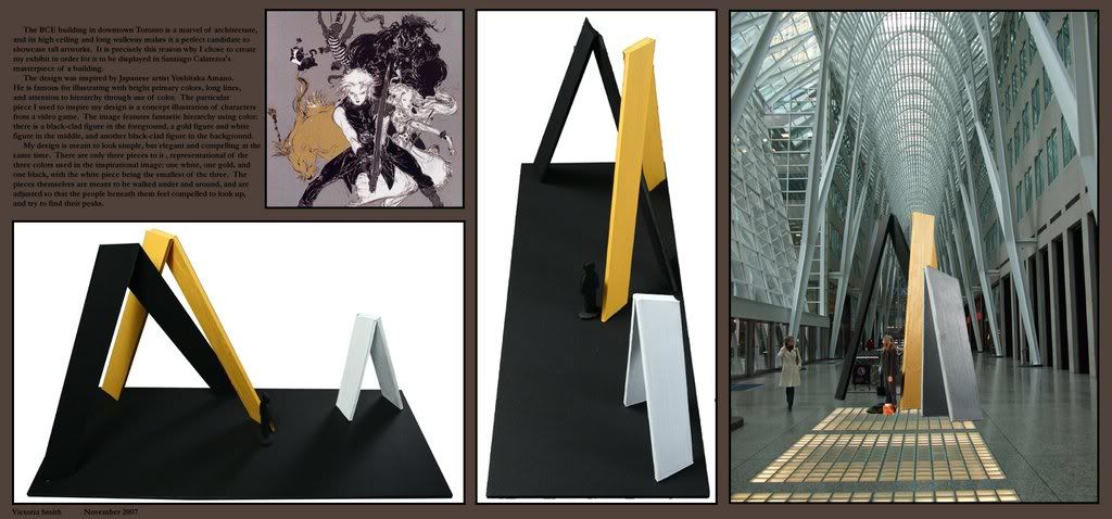
In this project we had to pick two things: an exisiting building (more specifically a large space in a building) and an artist.

We then had to come up with a display to put into that chosen space, which was inspired by the artist we chose.


The most fun we had with this project was the Saturday after she handed out the assignment - our professor offered to take us on a "field trip" of sorts downtown to actually stand in some of the suggested spaces and take pictures so we had a better idea of (thinking like professionals who would ACTUALLY be making these displays) the buildings themselves and what sort of grandiose things we could do with them.

Only three of us ended up going - but it was a BLAST.

Heidi (professor) took us to the business district in downtown Toronto. We spent an hour staring at the BCE building's skylight walkway, stared through windows at one building that was built on a perfect grid, and admired the gold in the RBC building's windows.

Then she took us to Queen street, where all the shops are, and showed us her favorite... COUNTRY BAR.

Cameron house is officially my favorite place to go: it's just a seedy little place that can barely fit 40 people, and the owners play in the band on Saturday nights. So Heidi took all of us in for a few rounds of country music and bought each of us a drink of our choice.


But after all the fun and games were over, it was actually a LOT harder a project than it sounded.


For starters, the artist I chose does a LOT of VERY detailed and VERY stylized watercolor paintings and concept art. Secondly, the space I chose was the BCE building walkway - which is EXTREMELY high-ceilinged.


However, in the end I succeeded.

My project was the simplest one in the class, but I KNOW I nailed it.

If you click on the image and make it bigger you should be JUST able to make out the words in the descriptive paragraph - if not, you can at least see the inspirational image.

3D design - project 2


This is the second project from my 3D design class. Unlike what I originally thought, the course had nothing to do with 3D rendering, or anything related to computers. It actually turned out to be much more fun than that.
My professor was a 3D designer who worked mainly for museums, doing displays. She'd come up with how to set up the displays, how to upholster them, etc. Because of all the different places she's worked, she had a lot of useful hints to share (and a lot of funny stories!)

I LOVED this project. It was quite possibly the most fun I have had in a LONG time. My mother also loved it, because it got me obsessed with fabric, something she has been trying to show me the joys of for YEARS.


This is how the project panned out:

We had to design some form of storage for a collection. Your collection could be anything, and as long as it was somehow stored (be it a box, a book, on a string...) you could make anything you wanted.

HOWEVER. What you chose as storage had to suit the colection you used.


I was at a bit of a loss for this one at first, since all my "collections" were at home, while I was living in residence hours and hours away. Eventually I bit the bullet and asked my mother to mail me a really old collection: my pokemon cards from grade school.

Nothing like looking through a box of brightly colored collectible cards to bring back fond memories.


Long story short: I chose to make hand-made, color-coded, books for my cards.

They're only about 20 x 17 centimetres high, and each page holds four cards (four in front, four in back - since they're double sided)

The covers are made of acid-free cardboard, covered in felt to cushion them, then wrapped in black silk. The insides are lined with more felt, color coded to match the elements of the cards inside.

Around the outside the covers are decorated with color-coded ribbons, and tie together at the sides.

Altogether there are four books.

3D design - project 1, part 2


This is the first project from my 3D design class. Unlike what I originally thought, the course had nothing to do with 3D rendering, or anything related to computers. It actually turned out to be much more fun than that.

My professor was a 3D designer who worked mainly for museums, doing displays. She'd come up with how to set up the displays, how to upholster them, etc. Because of all the different places she's worked, she had a lot of useful hints to share (and a lot of funny stories!)


This is how the second part of this project worked:

1) we had to pick our favorite shape from part one of the project

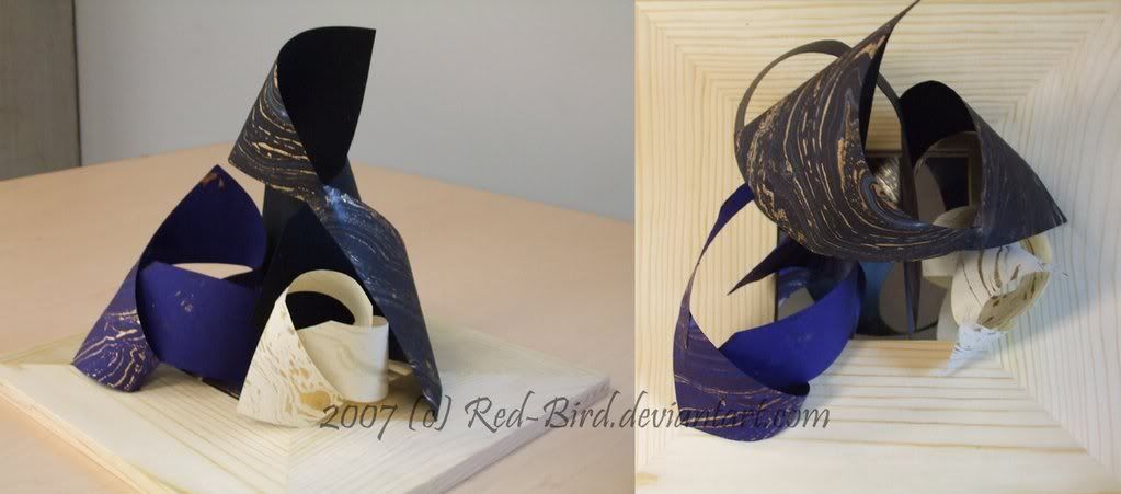
2) we then had to make either a superform, or a smallform, out of it (either make several large versions of the shape, or several very small versions of the shape) We were limited to up to 4 large shapes total, or up to 9 small shapes total - but no combining them.

3) we then had to pick a material of our choice, and make these super- or smallforms

4) the final portion was, as in the first project, mounting them on some sort of base

I chose to make a superform from my shape, and use a gorgeous gold paint-splattered paper I found while farting around in the Sheridan art supply section of the bookstore.

I then chose to mount them overtop of a mirror.

It has a REALLY neat effect (which the picture almost managed to capture, suprisingly enough)

If you look at it at the right angle you can't see anything but the reflection of the shapes - get too close, and your face distorts the image.

All in all this was my favorite part of project 1: I was much happier with this portion than the first.

I DO agree with my teachers comment that the combination of wood grain, mirror AND gold paint on the paper made it a little too busy. Had it been just the gold and mirror it would have been more effective in the end.

3D design - project 1, part 1


This is the first project from my 3D design class. Unlike what I originally thought, the course had nothing to do with 3D rendering, or anything related to computers. It actually turned out to be much more fun than that.

My professor was a 3D designer who worked mainly for museums, doing displays. She'd come up with how to set up the displays, how to upholster them, etc. Because of all the different places she's worked, she had a lot of useful hints to share (and a lot of funny stories!)

This is how the first part of this project worked:

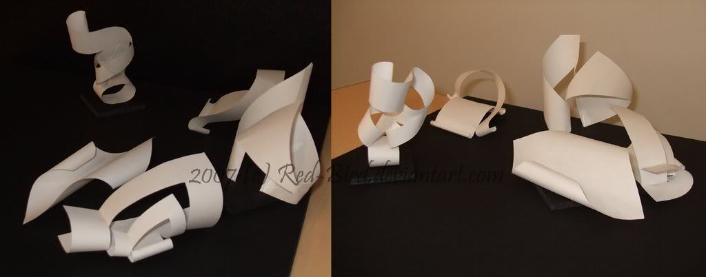
1) we had to make as many different shapes as possible using only 4' x 4' pieces of white paper. No pieces could be completely cut off (if you took it apart it had to go back to being that one white sheet), and no angles other than 45 or 90 degrees could be used for folding.

2) then we picked our best 5, made good copies of them, and arranged them all on black foamcore (which is basically tough foam sandwiched between two pieces of thick black paper)

3) the end product had to look different from every possible angle

I spent a lot of time sitting on the floor in the classroom spinning this thing in circles before I finally glued them in place.

(FYI the grand total of shapes I made was 62 - sadly they, along with the project itself, died painful deaths at the hand of a thunderstorm I had to stand out in while waiting for the bus)